

Responsiveness is a feature that you can add to your app. While using React Native app development services, you can consider different approaches which we will discuss in this blog. You will get a real codebase and the output for three different screens.
So, let’s start with the blog but before that let’s understand the concept of responsive apps.
What do you mean by a responsive app?
A responsive app is not specifically an app but it is a form of layout that you add to an app so that it becomes constructive even if it is run on different screens, different orientations, and different platforms. For this responsive feature, you need to build flexible images, adjustable grids, and images. And for this, you have to focus on designing the app’s UI.
You may be thinking what if your app is not responsive? It will reduce the application’s utility.
Now, you will learn about the pre-acquired criteria that you have to meet.
What are the pre-required learnings?
All you need to learn about the steps of setting up the React Native environment and how to create a simple React Native app.
As I discussed earlier, responsiveness is a way that makes your app more presentable on different screens, orientations, or platforms. So you need to make an app using React Native. For this, you can check the article in which I have explained in detail each step of creating a React Native app. However, before that, you have to get some software like Node.js, Android Studio, and others installed in your system. This being a part of setting up the React Native environment, you have to complete this step. Check the linked article, if you have no idea where to start and how to start.
As we are done with getting a theoretical understanding, let’s dive into the three actual approaches and the related practical scenario.
The first one: React Native Dimensions
Dimensions are just another React Native component that you use to fit the app as the height and width of the device in which you are presenting it. The most significant part of a responsive app is to get a responsive width and height based on which the app can fit any device.
For using the component in your codebase, you have to call the component from React Native. You can do this with the import statement.
After importing the Dimension component, you can either use the following syntax.
const windowWidth = Dimensions.get(‘window’).width;
const windowHeight = Dimensions.get(‘window’).height;
Or you can combine both the above code lines into one and use it in the following way.
const {height, width} = Dimensions.get(‘window’)
Here, you are directing the code to get the height and width of the window in which you are presenting your app.
See Also : What are the Pros and Cons of mobile apps in future?
Let’s take a complete codebase.
import React, {Component} from ‘react’;
import {View, Text, Dimensions, TouchableOpacity} from ‘react-native’;
const {height, width} = Dimensions.get(‘window’);
class App extends Component {
render() {
return (
<View
style={{
flex: 1,
alignItems: ‘center’,
justifyContent: ‘center’,
backgroundColor: ‘blue’,
}}>
<View
style={{
width: width – 60,
height: height / 3,
backgroundColor: ‘yellow’,
justifyContent: ‘center’,
alignItems: ‘center’,
}}>
<TouchableOpacity
style={{
backgroundColor: ‘#a9a9a9’,
alignItems: ‘center’,
width: ‘60%’,
height: 40,
justifyContent: ‘center’,
borderRadius: 25,
}}>
<Text>Life is a mess!!</Text>
</TouchableOpacity>
</View>
</View>
);
}
}
export default App;
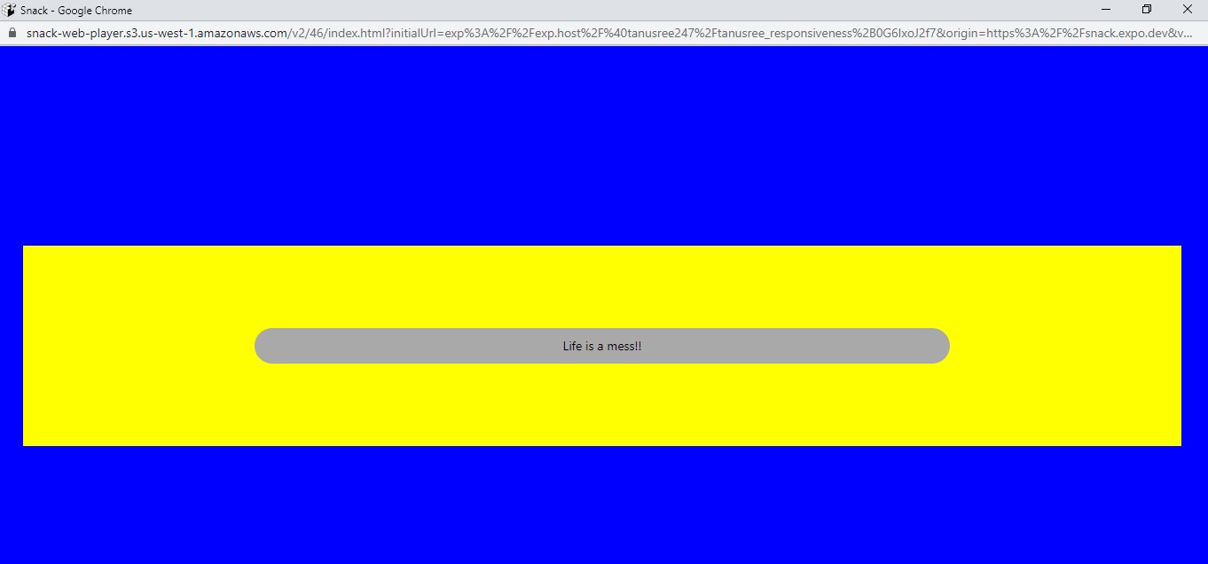
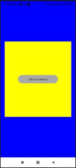
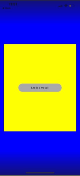
It is a sample code where the output will display a screen with the text “Life is a mess!”. The user will see this text element in a blue and yellow box.
Here, to test the responsiveness, we will present the app on three distinct screens. One is the web, the second one is the Android device and the third one is the iOS device.
Also, for the web, you have to run the code on the Snack and for the Android Device, I will run it on the Expo app. Refer to image 1 for the app output on the web, image 2 for the android device, and image 3 for the iOS device.
-Image 1
-Image 2
-Image 3
As you can notice from the above three images, your app will have a consistent display on three different devices and screens.
The second one: Flexbox
With flexbox, you can optimize the UIs of your app. It is specifically the layout that you need to embed in your app. While using the flexbox, you only have to consider using flex and flexDirection. Further, you may or may not use alignItems and justifyContent. It depends on your project requirements. However, I have used the property justifyContent in my project.
Now, we will discuss in more detail the flexbox components of React Native.
justifyContent:
With justifyContent, you can organize the chosen children in the main axis of the created container. Also, it is used for space-evenly, center, flex-end, flex-start, space-between, and space-around.
FlexDirection:
With flexDirection, you can easily control the children’s direction in the built container. The value of the FlexDirection can be set as column-reverse, row-reverse, row, or column. In simple words, you can place the chosen items in either a vertical or horizontal manner.
In our sample codebase, you will find the value of the flexDirection as ‘column’.
Flex:
Using flex, you can decide how to fill the space available in the container with the chosen elements. The division of the space is based on the flex property of the considered items.
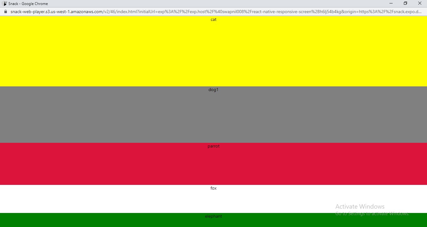
In the current sample codebase, we will use text items: parrot, fox, elephant, dog1, and cat.
Let’s see how you can give the value of flex and what it will mean for different flex values. As you will notice in the below-given codebase, every text is given a distinct content specification. The container is given 6 as its flex value, 5 for content 1, 4 for content 2, 3 for content 3, 2 for content 4, and 1 for content 5. For the total available space, you have to calculate all the values of the flex given to each element and the container. It will be 21. Now, the container will cover 6/21 of the total given space. Likely, the other text elements will take up the available space.
Now, let’s see the codebase and its output on three different screens.
import React from ‘react’
import { StyleSheet, Text, View } from ‘react-native’;
const Flex1 = () => {
return (
<View style={styles.container}>
<Text style={styles.content1}>cat</Text>
<Text style={styles.content2}>dog1</Text>
<Text style={styles.content3}>parrot</Text>
<Text style={styles.content4}>fox</Text>
<Text style={styles.content5}>elephant</Text>
</View>
)
}
const styles = StyleSheet.create({
container: {
flex: 6,
flexDirection: ‘column’,
backgroundColor: ‘black’,
justifyContent: ‘space-around’,
textAlign: ‘centre’,
},
content1: {
flex: 5,
backgroundColor: ‘yellow’,
textAlign: ‘center’,
},
content2: {
flex: 4,
backgroundColor: ‘grey’,
textAlign: ‘center’,
},
content3: {
flex: 3,
backgroundColor: ‘crimson’,
textAlign: ‘center’,
},
content4: {
flex: 2,
backgroundColor: ‘white’,
textAlign: ‘center’,
},
content5: {
flex: 1,
backgroundColor: ‘green’,
textAlign: ‘center’,
},
});
export default Flex1
Refer to images 4, 5, and 6 for the output in the web, android, and iOS devices respectively.
-Image 4
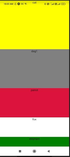
-Image 5
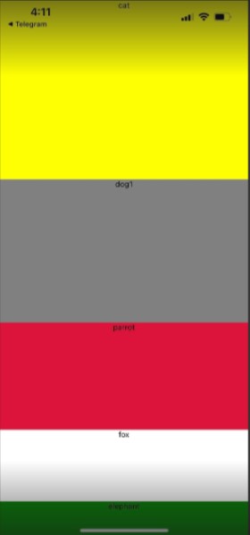
-Image 6
Now, the last approach is the Percentage dimensions. Let’s how it works in creating a responsive app.
See Also : How To Build A Laravel Web Application In Easy 7 Steps?
The third one: Percentage Dimensions
In percentage dimensions, you cannot use the whole values for width and height, rather use percentage values. Using whole values or hard values may be effective for a single screen size. It may not be flexible depending on the screen orientation and sizes.
On this note, both the Dimension approach and Flexbox approach may fail to achieve the desired responsiveness. However, one thing that you need to keep in mind is that you have to indicate the parent element with a definite value. This way, their child component will take the referred space in the main container.
In the considered code sample, you have to take the total height as 100%. This will allow you to make the height expansion flexible for three color elements.
import React from ‘react’;
import { View } from ‘react-native’;
const PercentageDimensionsBasics = () => {
return (
<View style={{ height: ‘100%’ }}>
<View style={{
width: ‘70%’, height: ‘20%’, backgroundColor: ‘pink’
}} />
<View style={{
width: ‘50%’, height: ‘50%’, backgroundColor: ‘magenta’
}} />
<View style={{
width: ‘75%’, height: ‘40%’, backgroundColor: ‘red’
}} />
</View>
);
};
export default PercentageDimensionsBasics;
As you can see, the width of the different colored elements has also taken the respective space (as pink has taken 70% and red has taken 75% of the total width available to them).
This is how the percentage dimensions work.
Refer to images 7, 8, and 9 for the output in the laptop screen, iOS device, and Android device respectively.
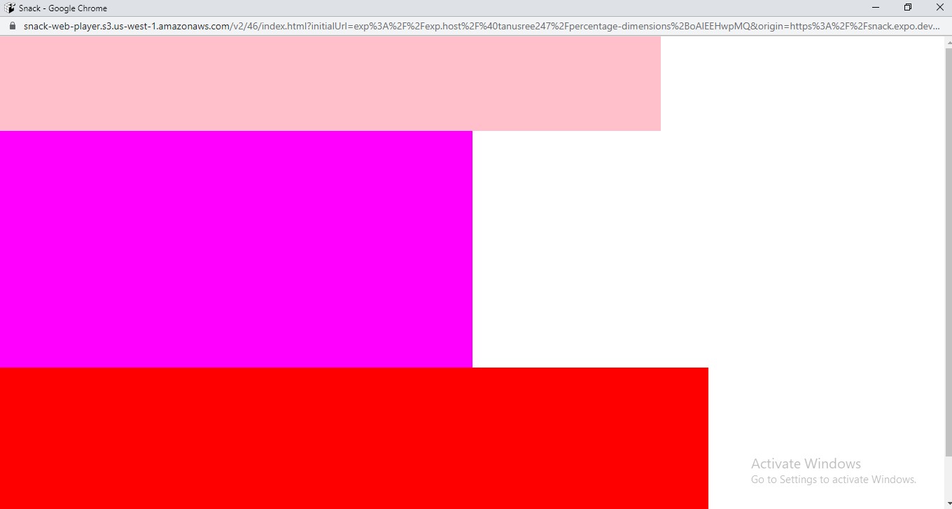
-Image 7
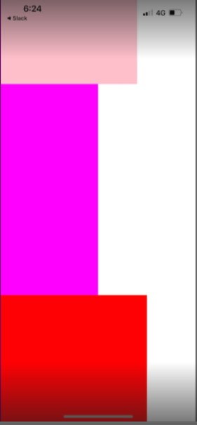
Image 8
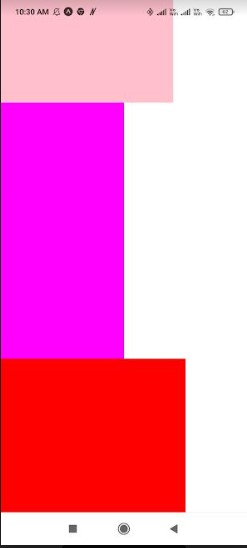
-Image 9
So, I hope you have understood the basic concept of responsiveness and what are the different approaches that you can take while creating an app.
We, at New Techno Times aim to provide the best technology information to readers to gain knowledge of what is going on in the world around us. For related blogs about cybersecurity and technology, Digital Marketing, Business, Education keep following us.